SAMSUNG
USA.
award-winning software packaging, brainstorming & concept, design, on the shelf ...twice


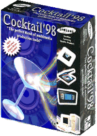
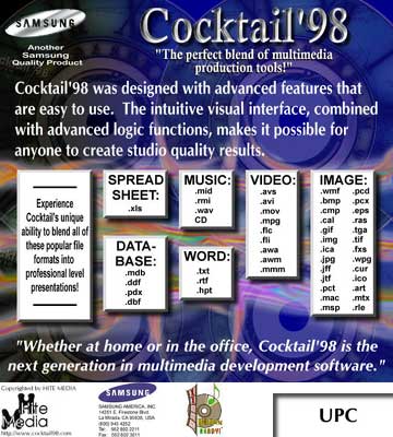
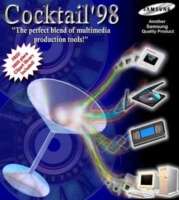
Cocktail'98
COMPLETE Packaging Design:
Box with folding front flap
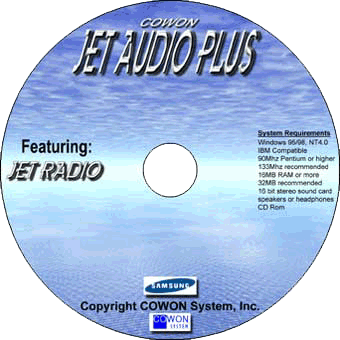
2 CD-ROM Discs
2 CD-ROM Jewel Cases
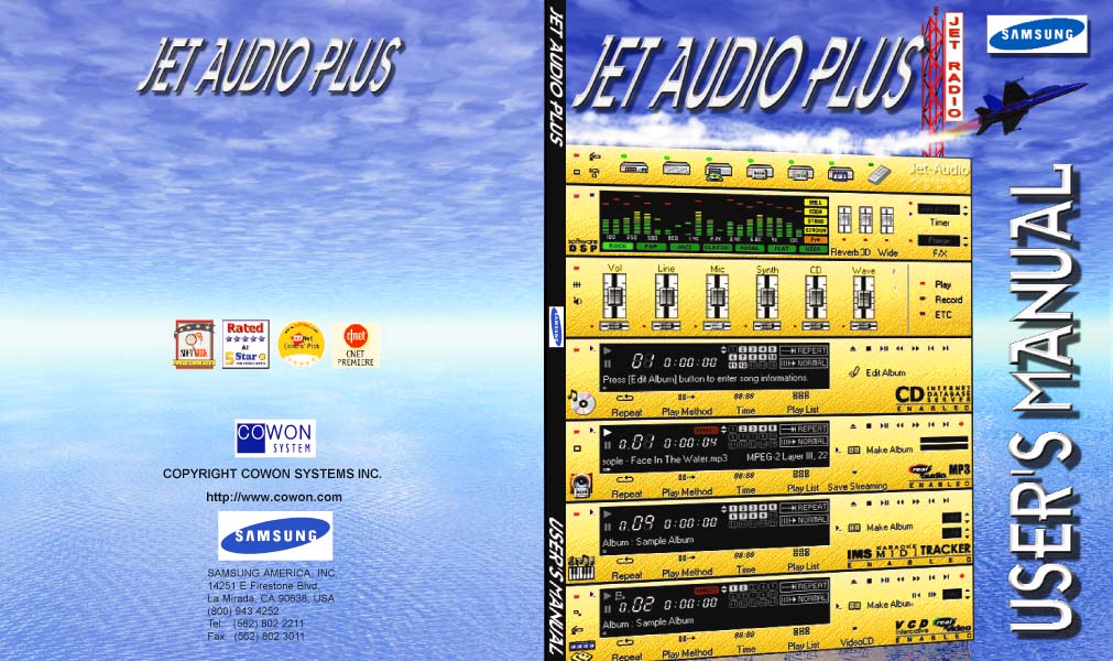
Manual
Templates for Die and Cut
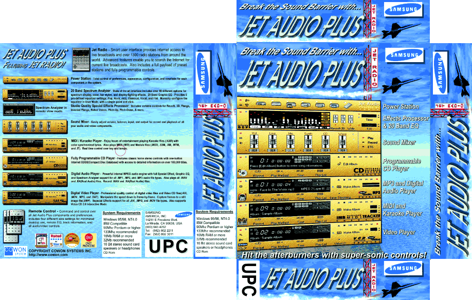
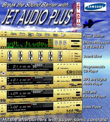
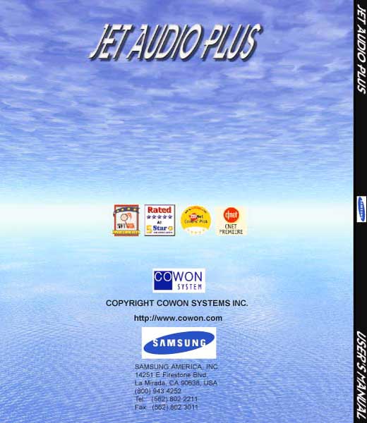
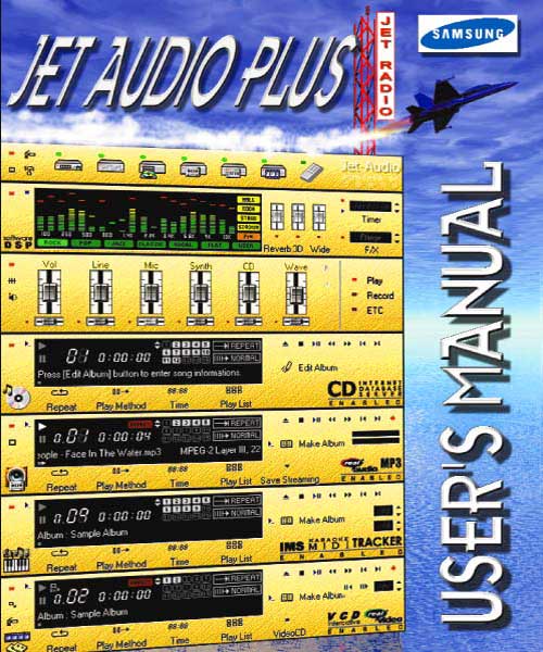
Jet Audio Plus
COMPLETE Packaging Design:
Box Design
CD-ROM Disc
CD-ROM Jewel Case
Manual
Templates for Die and Cut


OBJECTIVE
Engineer the Physical Touchpoint. Samsung Electronics (Global Consumer Electronics Leader).
The Landscape: In the world of consumer electronics, the "Unboxing Experience" is the first moment of truth. It is where the brand promise meets physical reality. For a giant like Samsung, packaging is not just a container; it is a meticulously engineered stage for the product.
The Mandate: We were tasked with executing the structural and visual packaging design for the JetAudio product line. The requirement was absolute precision: zero tolerance for error, global compliance, and a tactile finish that screamed "Premium" before the box was even opened.
TARGET
Samsung does not need an introduction. They are the benchmark for global hardware. When you work at this flight level, "creativity" takes a backseat to execution.
The challenge is not just "making it look good"; it is ensuring that the foil stamp aligns perfectly with the emboss across millions of units, that the structural integrity survives global shipping, and that the user feels a subconscious sense of value the moment they touch the matte finish.
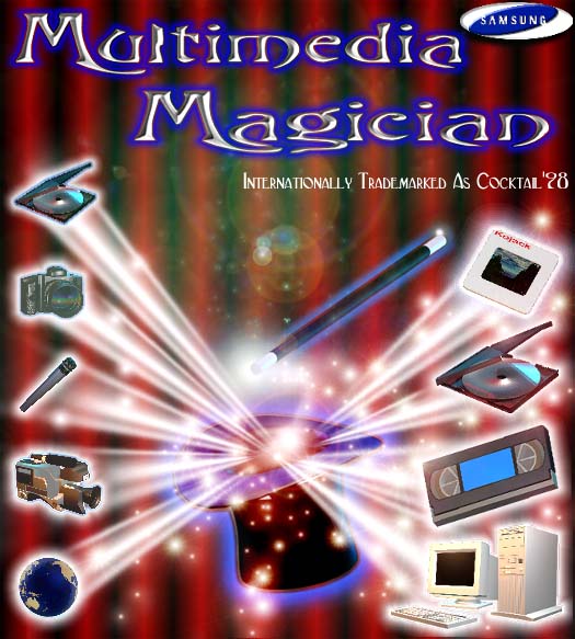
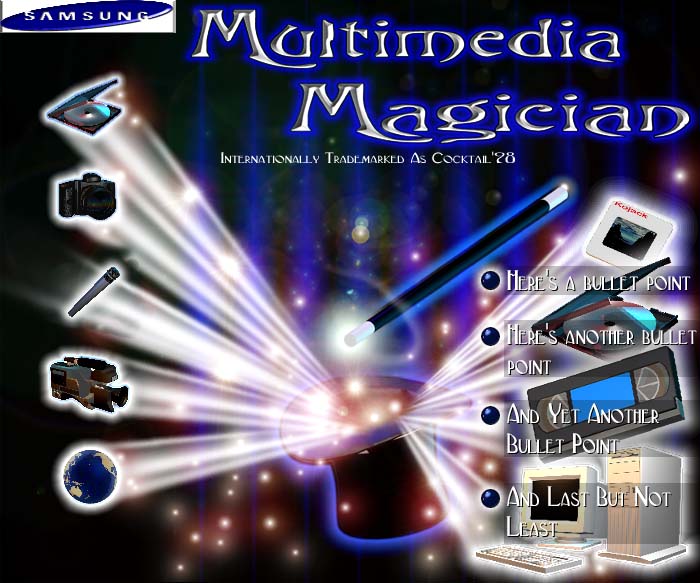
I worked with the late Joel B. Katz, Director of Marketing for SAMSUNG: USA, to custom design this award winning software package. We attempted to re-brand the product as "Multimedia Magician" but SAMSUNG Korea rejected the concept and we went with the original title "Cocktail'98".
Then... Joel brought me another project: Jet Audio Plus. It was another software packaging project and we had a lot of fun brainstorming and conceptualizing.
DEPLOYMENT
Status: Global Retail Deployment.
We delivered a packaging system that balanced aesthetic minimalism with structural rigidity.
-
The "Matte/Gloss" Warfare: We utilized a deep matte black substrate with high-gloss UV spot varnishes. This created a "Ghosted" effect where the branding was visible only when the light hit it correctly—a hallmark of high-end tech.
-
Structural Engineering: We designed the internal tray architecture to present the device "face up" upon opening, ensuring immediate eye contact between the user and the product.
-
The Silver Standard: All typography was executed in a hot-stamp silver foil, reinforcing the "Cyber-Silver" aesthetic that defines the high-tech sector.
CLIENT
- Samsung USA
- Joel B Katz
- Consumer Software
- Global Tech Sector
SERVICES
-
Structural Packaging Design
-
Print Design
-
Visual Identity Systems
DELIVERABLES
-
Retail Box Architecture
-
Quick Start Guides (QSG)
-
Global Retail Assets
OTHER
- Retail Dominance
-
Award Winning
-
Brand Governance
-
Market Authority
STATUS
- GLOBAL RETAIL ASSETS