Donald R Hughes
A commissioned identity for DRH Enterprises
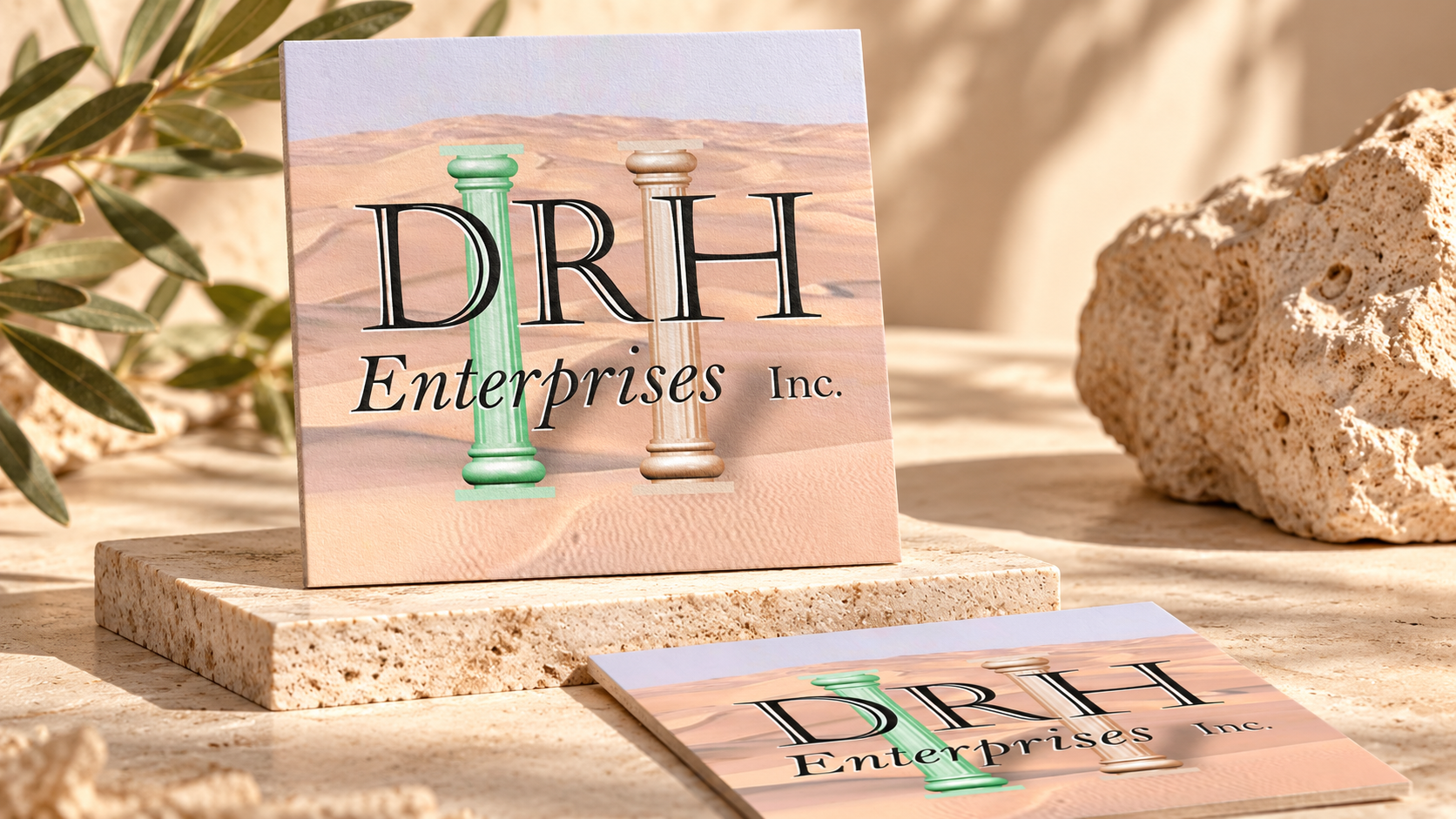
Donald R. Hughes commissioned me to develop a logo and business card to his specifications. The initials in DRH Enterprises come directly from his name. The original assignment called for a recognizable identity and a practical printed format that could carry it into everyday business use.
The artwork combines large serif initials with two classical columns and a warm landscape background. The initials lead the composition, while the smaller Enterprises line completes the business name. The background gives the mark a setting, and the columns add a distinct visual element that can remain recognizable when the artwork changes format.
Translating the logo into a business card
The card uses the same visual vocabulary in a vertical composition. The identity sits at the top, followed by the name and business details. That repeated treatment connects the printed piece with the larger logo presentation.
A business card asks the design to do two jobs in a small space: identify the organization and organize the information a reader needs to keep. The original card gives those functions separate areas while using the background to hold the composition together.
Original artwork and a specific client brief
The gallery preserves the original logo and card so the relationship between them can be seen directly. This is a focused identity assignment, built around a named client's specifications rather than a broader inferred brand program.
The project shows the value of carrying a visual idea through to its practical application. The larger logo establishes the name and its visual character; the card turns that character into a piece that can be handed to another person. The two formats form the documented body of work for this commission.