Finish Line Collision and Custom
Identity and a sixty-second radio commercial
My original portfolio records a logo and a sixty-second radio commercial for Finish Line Collision and Custom. The project connects two ways of making the business recognizable: a visual mark for the name and a short audio format for its promotional message.
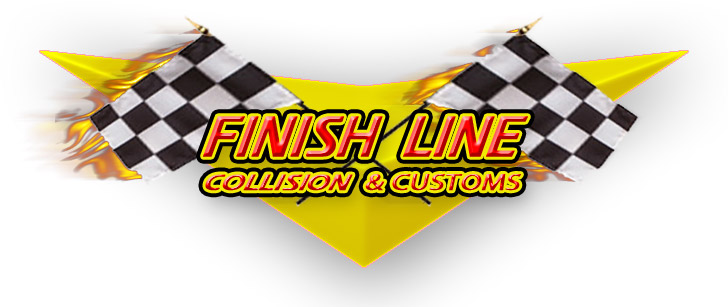
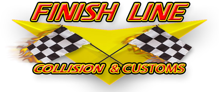
The original logo artwork uses checkered racing flags, strong italic lettering, and a bright yellow shape. These elements make the automotive association immediately visible. The lettering gives the name energy, while the Collision & Customs line identifies the business beneath it.
An identity with movement and contrast
The two original treatments explore the arrangement of the same core elements. One places the name and descriptor within the flag composition; the other gives the Finish Line name more space above it. Both use red, yellow, black, and white to keep the design bold and readable.
The repeated visual elements make the variations feel related while allowing the name and supporting line to occupy different positions. The gallery shows those differences directly, giving a clear view of the original identity work.
A focused promotional assignment
The documented scope includes both logo design and the radio spot. That combination brings the business into visual and spoken presentation, where the name needs to remain clear even as the medium changes.
The original artwork below preserves the identity side of that assignment. The current portfolio cover places it in an automotive-shop setting, while the gallery lets the viewer inspect the actual logo treatments and their composition.