
ACTS OF PIRACY
I built the website and logos for Acts of Piracy, Robin Grattidge’s collection of pirate gear, decorative metal castings, and rare treasures. The site brings swords, knives, belt buckles, jewelry, figures, and ornaments together in a distinctly pirate-themed storefront.
The work combined a custom WordPress site, photo galleries, social media integration, and event information. Matching shop-category artwork gave the collection a consistent visual identity and made the different types of merchandise easy to explore.
- Robin Grattidge
- Pirate gear & collectibles
- Decorative metal castings
- Custom WordPress website
- Content migration
- Photo galleries
- Logo design
- Shop-category graphics
- Website presentation
- E-commerce storefront
- Social media integration
- Events & calendars
Original website artwork
Explore the original logo, landing artwork, and shop-category graphics in the gallery below.
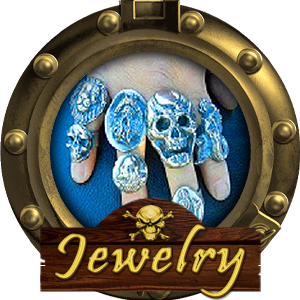
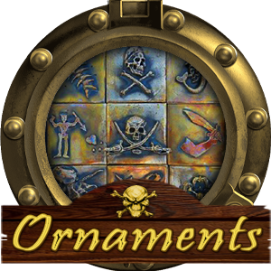
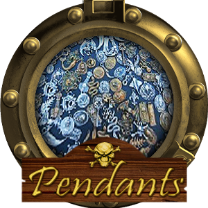
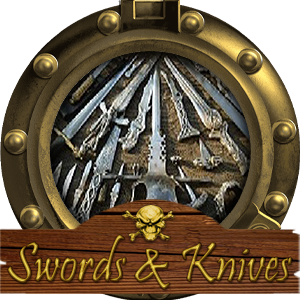
Artwork in this gallery
- Original logo
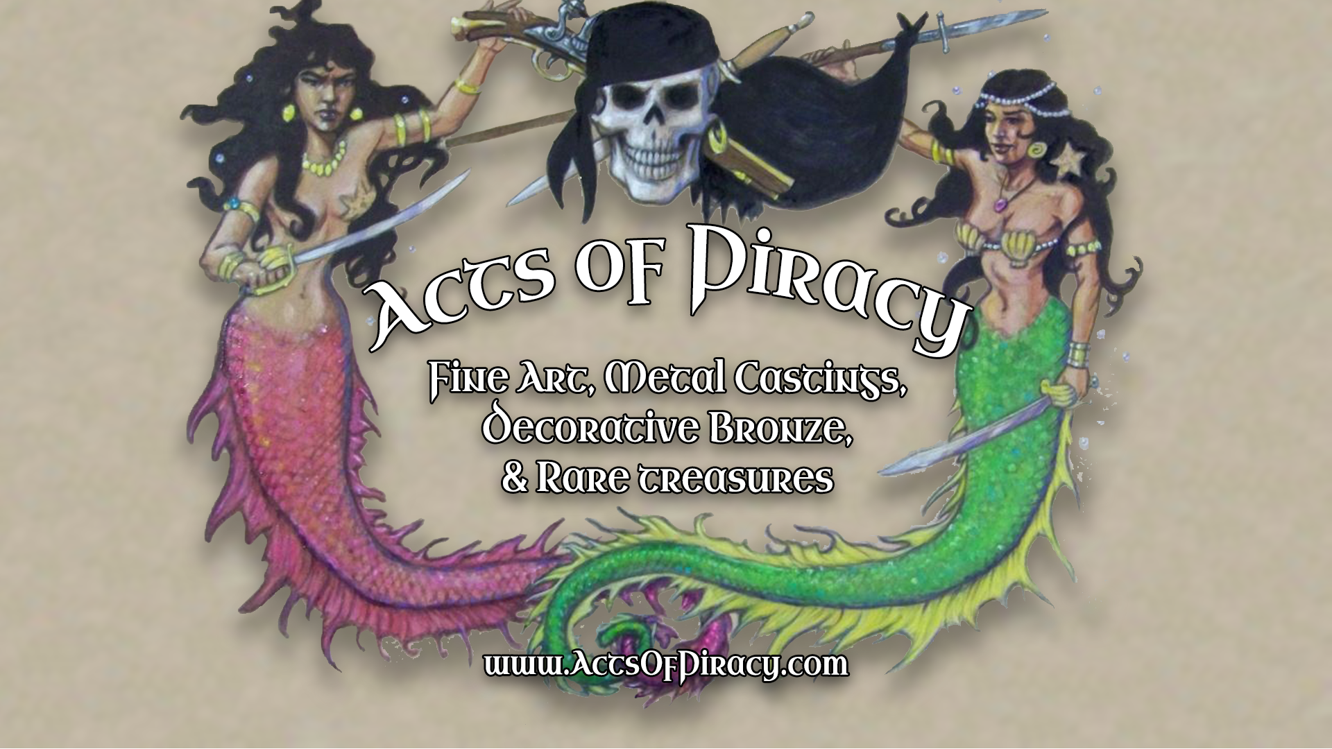
- Original landing artwork
- Belt buckles
- Figures
- Jewelry
- Ornaments
- Pendants
- Swords & knives
A pirate shop should feel like an invitation to step aboard
Acts of Piracy brings together pirate goods, a memorable personality, and the pleasure of discovering something unusual. Robin Grattidge’s offerings include swords, daggers, belt buckles, decorations, and other pirate-related accessories. The website and identity work needed to give that collection a setting with as much character as the subject itself.
I was hired by Robin, a longtime friend, to build the website and logos. The assignment brought together an expressive visual identity and the practical work of organizing a WordPress site: presenting the goods, making photographs available, connecting the social presence, and providing a place for news and events.
Character at the entrance. Clear choices inside.
The original landing artwork establishes the atmosphere before the visitor starts browsing. The category graphics then give that visual world a useful structure. Buckles, swords and knives, figures, jewelry, and ornaments each have their own illustrated entry point in the archived storefront.
That combination is central to the project. A visitor can enjoy the pirate theme while still finding a particular kind of item. The graphics give the categories personality; the labels tell the visitor where each route leads. The artwork is part of the navigation as well as part of the identity.
The original logo and shop graphics collected above show the relationship between the brand and its individual categories. They belong to the same presentation, but each category has a recognizable purpose. A small accessory and a dramatic blade do not need the same picture to tell their story.
A place for the goods—and the people around them
The website brief extended beyond product presentation. Photo galleries, social-media connections, and updated calendars were also part of the work. Those elements make room for the wider activity around the brand: people, events, images, and news that help a visitor understand the world behind the merchandise.
The archived site includes About, Gallery, News, Contact, Shop, and Cart navigation. It shows how the visual identity sat within a working site structure, with clear destinations for browsing, learning more, and reaching the business. WordPress supplied the content-management foundation for that collection of pages and materials.
Content migration, photography-related materials, and continuity across the presentation were also part of the work. The practical details support the theatrical first impression: a distinctive entrance needs an organized site behind it.
The original work tells the story
This case study brings the identity, landing artwork, and category graphics together so the visual system can be explored in one place. The archived client website provides the surrounding context: the navigation, storefront categories, gallery, news, and contact structure in which that work appeared.
For me, Acts of Piracy is a project where personality and usability belong together. The imagery sets the mood. The categories make the collection approachable. The website gives Robin’s pirate goods a place where visitors can explore the character of the brand and find their way to the details.