
BareFootery
An identity built around self-expression
BareFootery's brand documents describe foot accessories—anklets, toe rings, nail color, and related adornment—with a message of confidence and personal expression. The creative brief asks the identity to feel elegant, approachable, and uplifting. My logo work translates that direction into a compact visual mark and a readable brand name.
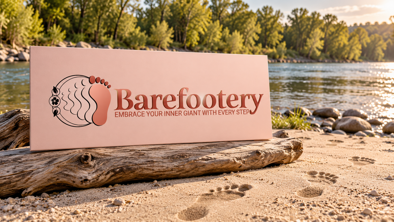
The approved logo combines a stylized foot with ornamental detail and the Barefootery wordmark. Its warm colors and delicate linework connect the symbol to the accessory category. The accompanying line, “Embrace your inner giant with every step,” gives the identity a clear verbal theme: the accessories are presented as an expression of the person wearing them.
A mark that explains the category
A new brand name benefits from a visual clue. The foot motif gives that clue immediately, while the decorative treatment suggests jewelry and adornment. The wordmark provides the direct reading of the name. These elements divide the work between recognition and explanation without requiring a long description beside the logo.
The original brief also considers how an identity may appear on a website, packaging, social content, and marketing materials. Those are intended applications of the brand system. The artwork shown here documents the logo work; it does not imply that every proposed application became a finished production item.
From brand direction to presentation
The mission and logo specifications provide useful context for the design choices: confidence, growth, elegance, and a connection to the idea of taking a step. The final presentation brings those ideas into a single visible identity. The original logo below lets the viewer inspect the artwork directly, while the sandy river-beach cover places the approved identity in a setting chosen for this portfolio.
The result is a brand-design case study where the product category, the visual symbol, and the brand message reinforce one another. It shows how an expressive brief can become a clear name-and-symbol presentation without losing the personal tone of the original concept.
