Brain Power Institute
A product line built across packaging, promotion, and physical display
My work for The Brain Power Institute helped develop the visual presentation of an audio-product line associated with Dr. Jeffrey Thompson. The original portfolio records document a broad assignment: logos, product packaging, marketing materials, promotional packaging, website design, and event kiosks. The collection reaches from small disc packaging to physical displays that visitors could approach in person.
A series needs more than a different picture for every title. It needs a common structure that helps readers recognize the family and distinguish the individual products. The METAMIND materials use a shared name treatment, a consistent placement of identifying information, and distinct color groups. That structure carries across the jewel-case artwork, posters, and product sheets.
Twelve titles, one recognizable family
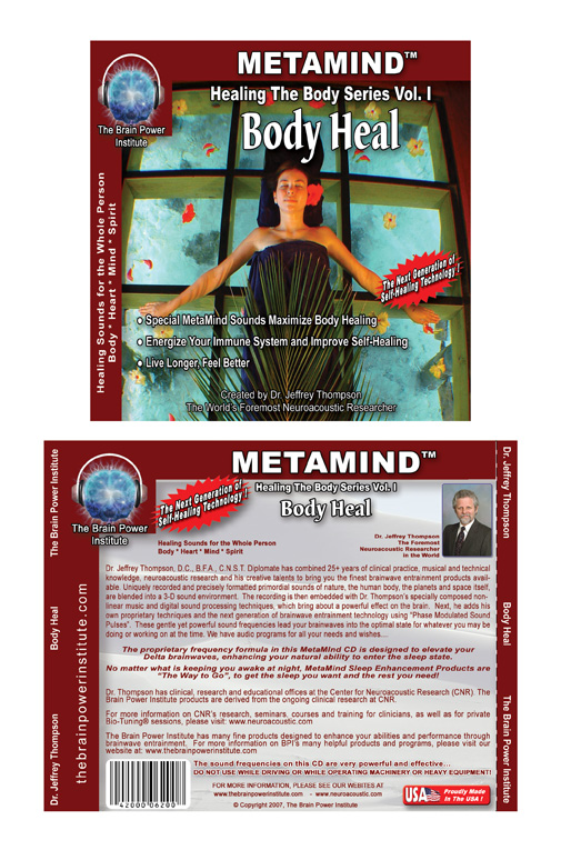
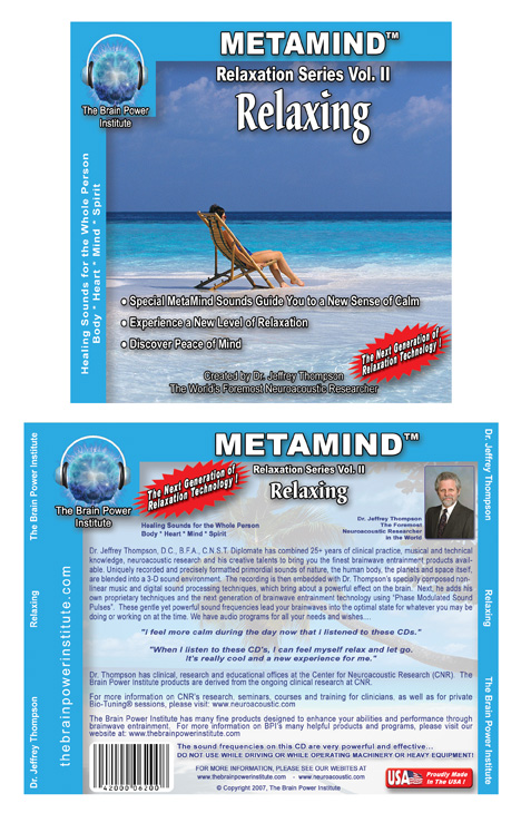
The original jewel-case collection includes Allowing Love, Body Heal, Healing the Heart, Inner Discovery, Inner Physician, Memory Learning, Mind Over Body, Relaxing, Sleep Like a Baby, Sound Sleep, The Einstein Way, and Unwinding. Each has its own subject and imagery. Repeated framing, typography, and information placement give the series continuity.
The full front-and-back artwork shows two different reading tasks. The front establishes a title and a visual mood. The back gives the product much more explanatory space. The design has to accommodate both: a clear first impression and a denser area that remains organized when a reader wants the details.
This gallery preserves the original packaging as design work. Product names and statements printed on the historical artwork reflect the original collateral; this case study makes no current therapeutic or clinical-effectiveness claims.
Taking the system into larger formats
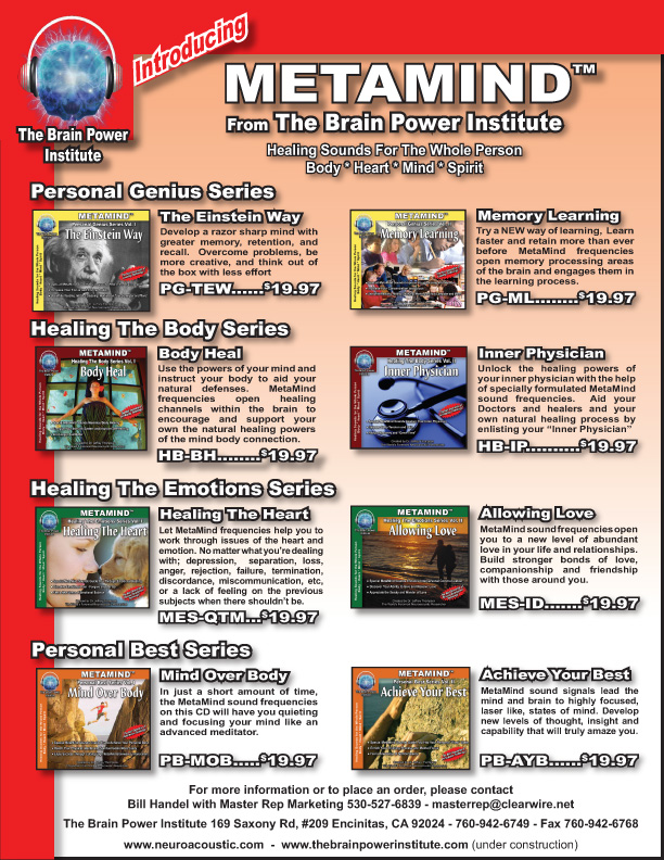
The posters translate individual titles into larger promotional pieces. The product data sheets bring several titles together so the reader can compare the series within a common visual frame. A consistent system makes those changes of scale easier: the title and identity remain familiar even when the amount of information changes.
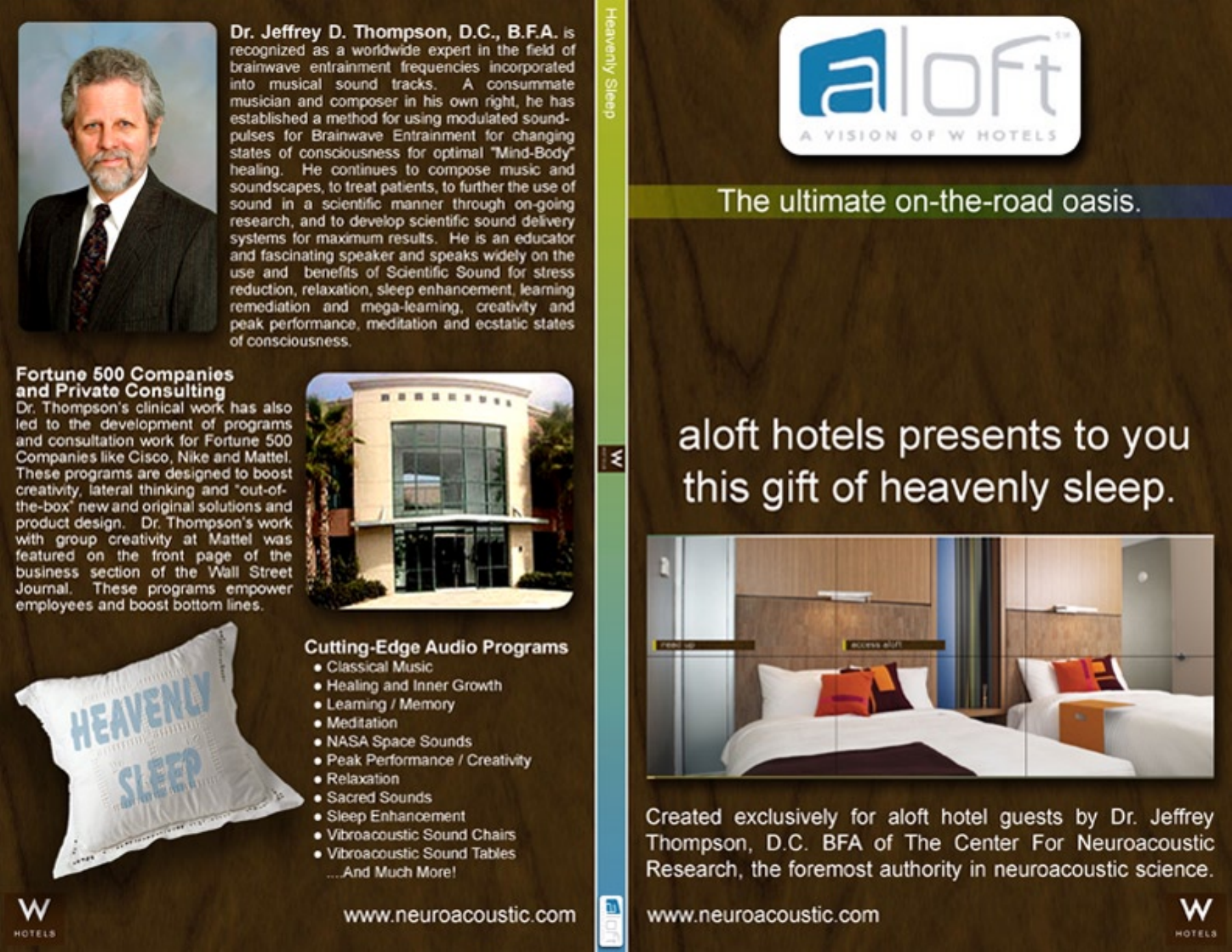
The Starwood / aloft promotional-package artwork adds another kind of context. The original layout brings the audio subject into a hospitality presentation, combining the hotel's branding, an accommodation image, and information about the creator. It documents an original promotional design rather than a claim about a current hotel program.
From screen renderings to constructed kiosks
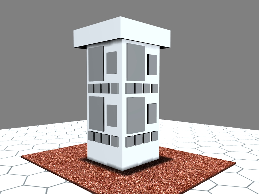
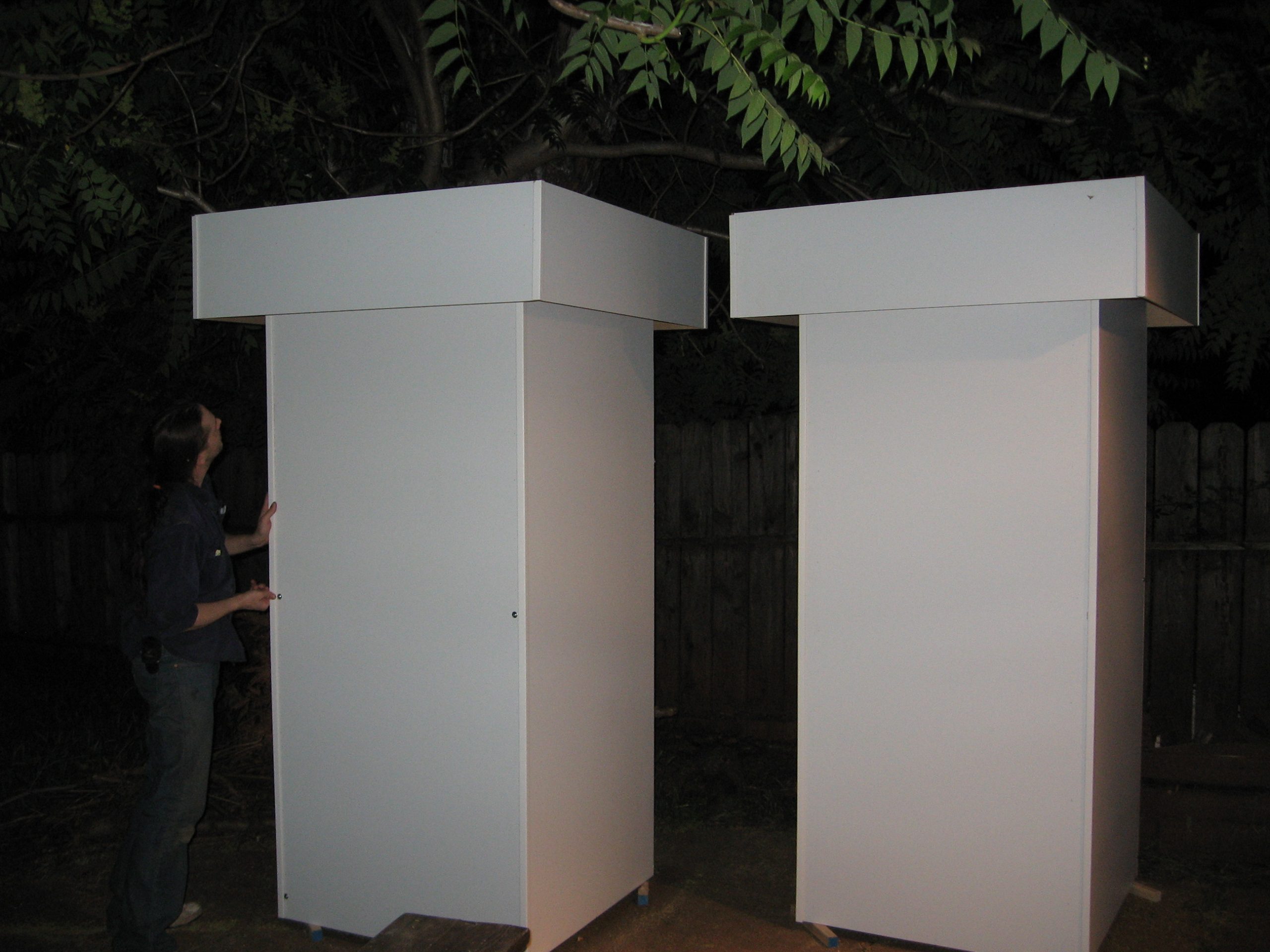
The archive also records the physical side of the assignment. A three-dimensional kiosk visualization explores the display's form before construction. Workshop photographs show the building process, printed promotional pieces, and the constructed kiosk shells. These images connect the presentation concept to the practical work of producing a display.
Designing across those formats calls for attention to different viewing distances and information needs. Disc artwork can be examined closely; a display needs a recognizable shape and a strong visual entrance. The identity and product system provide the connection between them.
Explore the original work
The gallery combines the complete jewel-case series with selected complementary posters, data sheets, the original identity, kiosk design and construction, and the promotional package. Open an image for a closer view. The original packaging PDF is also available below.
The related Center for Neuroacoustic Research project documents my website-finishing and product-logo concept work for another presentation of Dr. Thompson's organization.