Enfish
Promotional cards for a software launch and expo activity
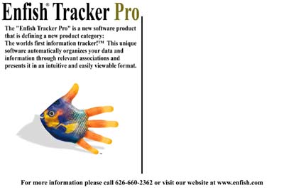
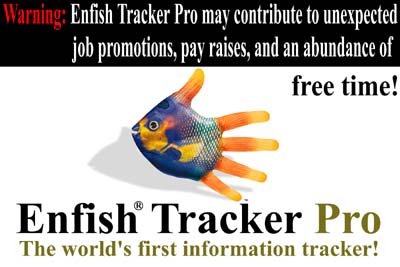
My Enfish work created promotional cards for Enfish Tracker Pro and its expo activity. The original collection uses a distinctive fish-and-hand image as its visual anchor, with different headlines and information treatments around it. The assignment is about introducing software through print promotion: give the reader a reason to look, then make the product name and next step easy to recognize.
The cards speak to a familiar problem: a growing amount of information and too little time to manage it. Some lead with an attention-getting headline; others devote more space to the product description. The repeated product name and central image connect those different approaches into a recognizable campaign.
A visual hook with several copy approaches
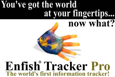
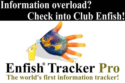
“So much information… so little time!” compresses the problem into a short opening line. Another card uses a fingertip metaphor to connect the image with access to information. The Club Enfish treatment gives the same visual idea a more playful promotional setting.
Those variations show how one image can support several messages without losing the campaign's identity. The balance changes from card to card: headline, picture, product name, and explanatory text each take a different share of the available space. The result is a set of approaches suited to different reading situations.
Product explanation and event promotion
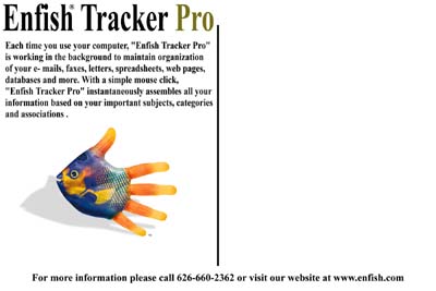
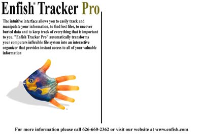
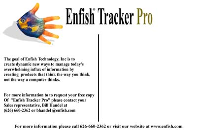
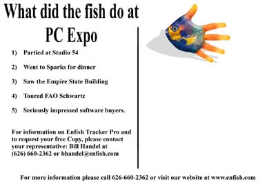
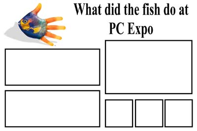
The information-led cards give more room to describing the original software's organization and tracking functions. The expo cards shift toward an event-oriented message, including a playful account of what the fish did at PC Expo. These pieces connect the product introduction to its promotional activity.
The gallery includes the original cards and an expo layout study. That study is identified separately from the finished promotional treatments, preserving the development material without confusing its role.
The original campaign artwork
The artwork documents the promotional-card assignment and the language used in the original product campaign. It is presented as historical marketing work; product claims printed on the cards belong to that original collateral.
The collection shows the practical relationship between a visual idea and specific copy. A memorable image starts the conversation. A clear product name, a recognizable problem, and enough explanation give the reader a reason to continue. This project brings those parts together across a varied set of original print pieces.