Simply Mariah
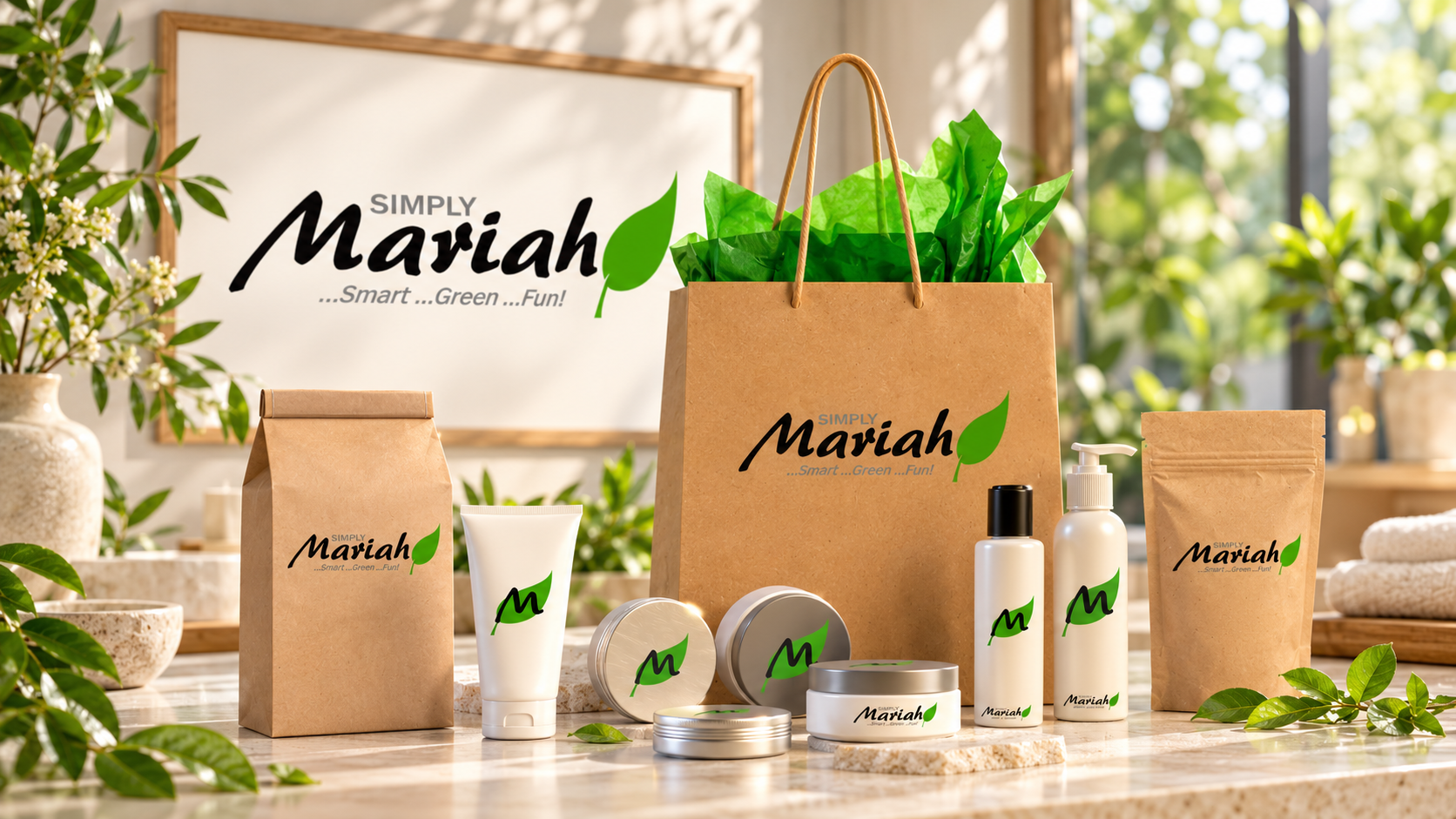
A natural direction for a health and beauty brand
Simply Mariah is a health and beauty brand with an organic-product focus. The identity pairs the name with a bright green leaf, giving the brand a direct visual connection to its natural-product direction.
The project’s visual language is compact and personal. The name remains the main identifier, while the leaf gives the identity a recognizable symbol that can accompany it.
Name, symbol, and a short brand line
The original logo combines dark lettering, gray supporting text, and a green accent. The line “Smart… Green… Fun!” introduces the tone of the identity without adding a long explanation.
The leaf contrasts with the lettering and provides the most immediate color cue. Its simple shape helps keep the natural theme visible even when the surrounding presentation is restrained.
A compact identity with room to adapt
The visual direction also includes a leaf-based monogram. That gives the identity a smaller form alongside the full name treatment, useful when space is limited.
Keeping the leaf motif consistent connects the larger wordmark and the compact symbol. The design can vary in scale while retaining the same central visual idea.
Project focus
- Brand identity and logo presentation for Simply Mariah.
- A green leaf motif paired with the business name.
- A short, coordinated brand line.
- Full-name and compact-symbol identity treatments.
The original identity
Select the original logo below to view its lettering and leaf detail in the lightbox.