
Grandmother’s Healing
A botanical identity across packaging and the web
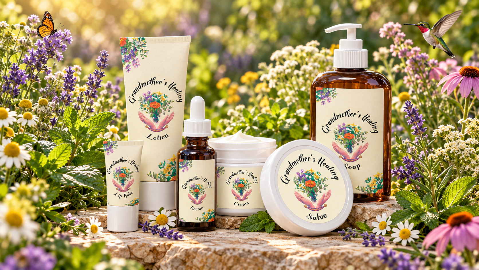
Grandmother’s Healing brings a floral illustration, a handwritten-style name and a soft cream label treatment together in one visual identity. The original presentations show how those elements carry across a range of package shapes and into a website welcome page.
A coordinated family of labels
The packaging mockup places the same central illustration on tubes, jars, a dropper bottle and a pump bottle. Flowers and foliage repeat around the edges, while the product names sit below the identity. This arrangement gives the containers a shared appearance without making their labels identical.
The warm label background creates contrast against both white containers and amber glass. Curved lettering follows the illustration, keeping the name and botanical artwork closely connected.
The identity on screen
The original iMac presentation shows a website welcome page with a large central version of the floral mark. Purple accents connect the page header and lower edge, while a smaller identity appears beside the navigation.
These are historical design presentations: the packaging image is a mockup, and the desktop image shows the website’s visual treatment. Together they demonstrate continuity between the physical and digital sides of the brand.
Original packaging and website samples
Select either image to explore the original work in the gallery lightbox.

